
Language

FR EN
Creamy Scoops Logo

CREAMY SCOOPS: FROM PASSION TO IDENTITY

An editorial journey exploring the birth of a vibrant, nostalgic ice cream brand rooted in vintage Americana charm.

#1

Where Did Creamy Scoops Come From?

An Idea Born from Frustration

I’ve always had a particular admiration for American culture, especially its vintage aesthetic. Diners, their colours, their signs,… I’ve always been drawn to this whole world.

The problem was that I couldn’t really find this kind of concept near me. So rather than looking for a place that matched what I had in mind, I felt like creating it myself.

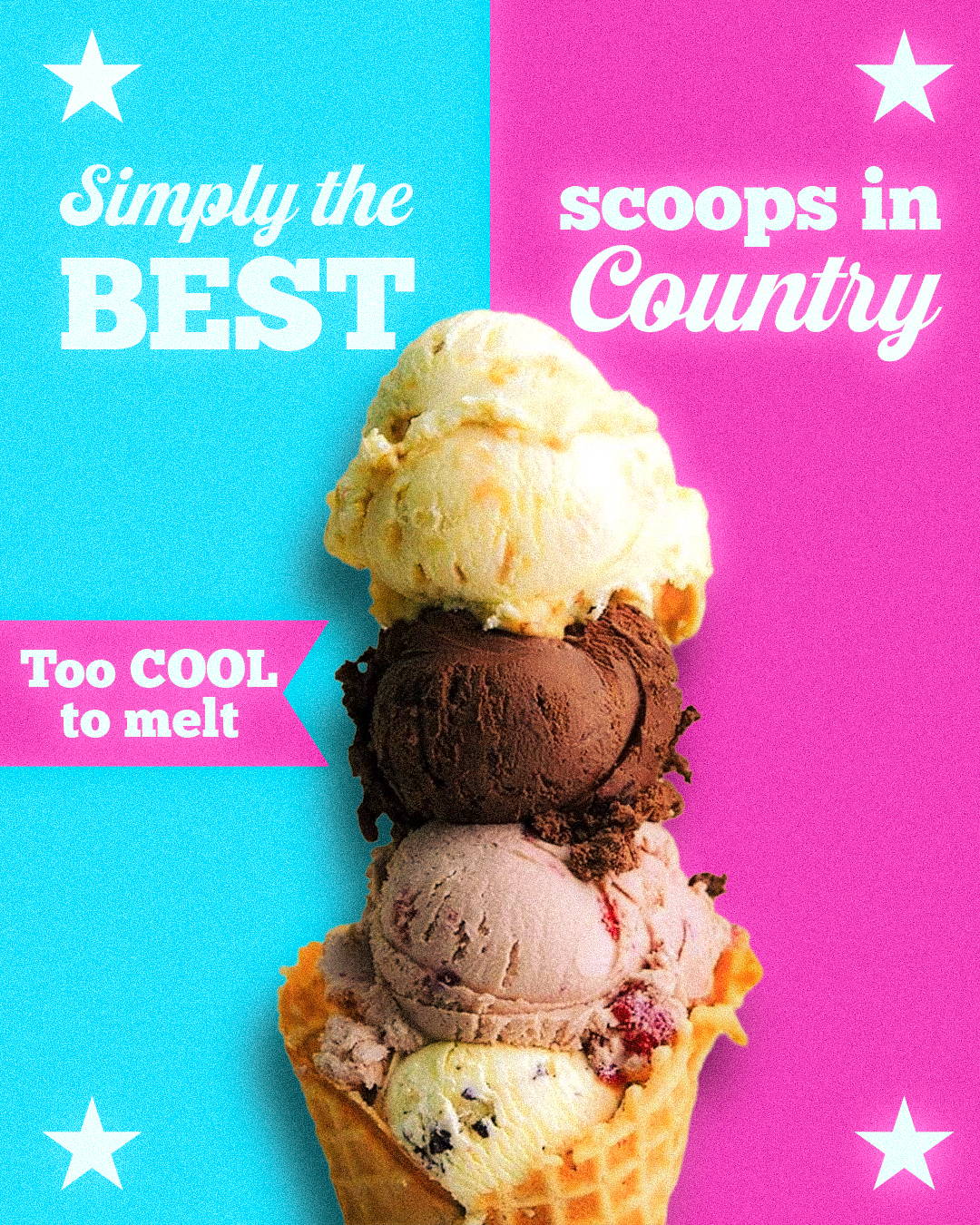
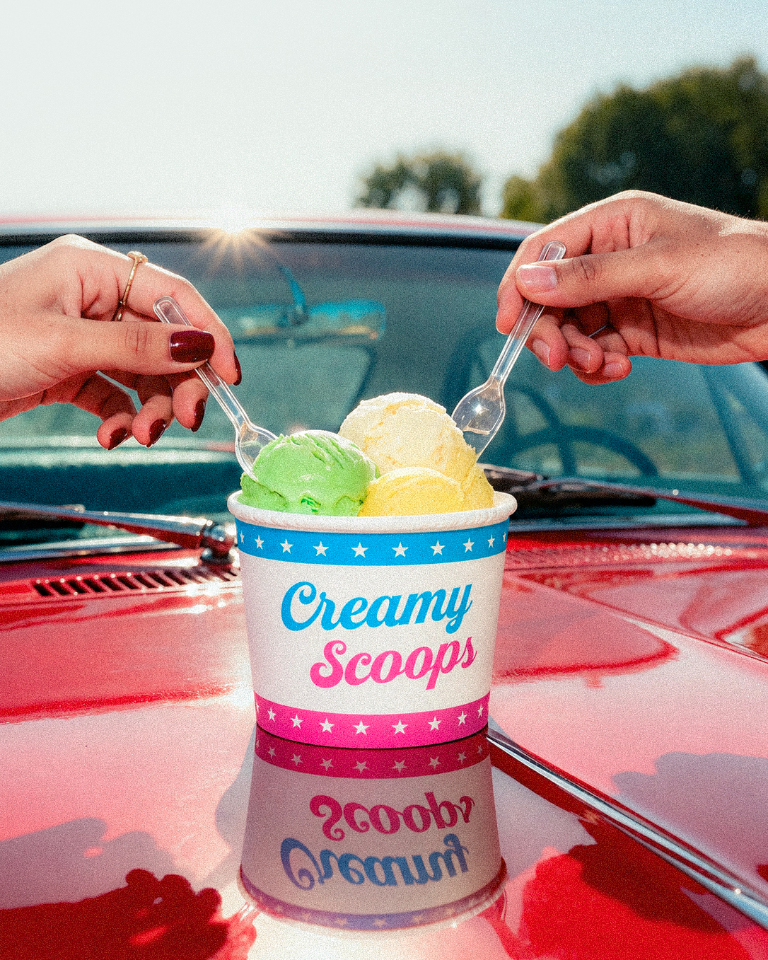
Creamy Scoops became the idea of a cool, colourful and full of personality ice cream brand. A brand with visuals that catch the eye, but above all, a real place that you would want to walk into, sit down and spend some time in.
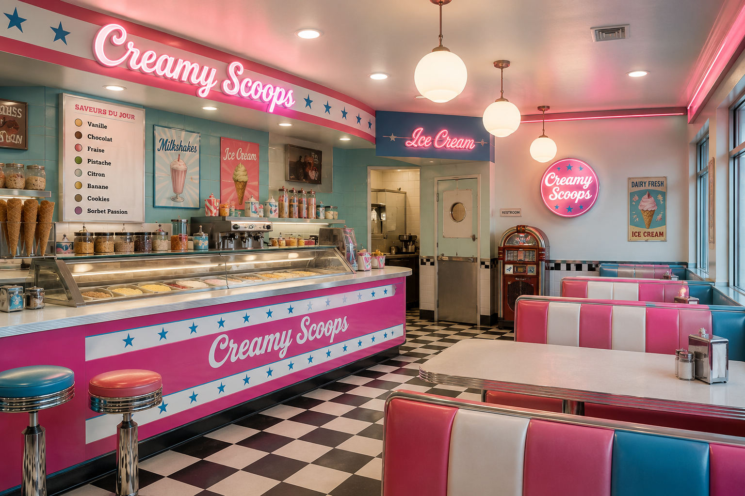
AI generated

The idea was therefore not simply to create an ice cream brand, but to imagine the place I would have wanted to find myself.
#2

The Brand Mood

Nostalgia for an Era I Never Lived.

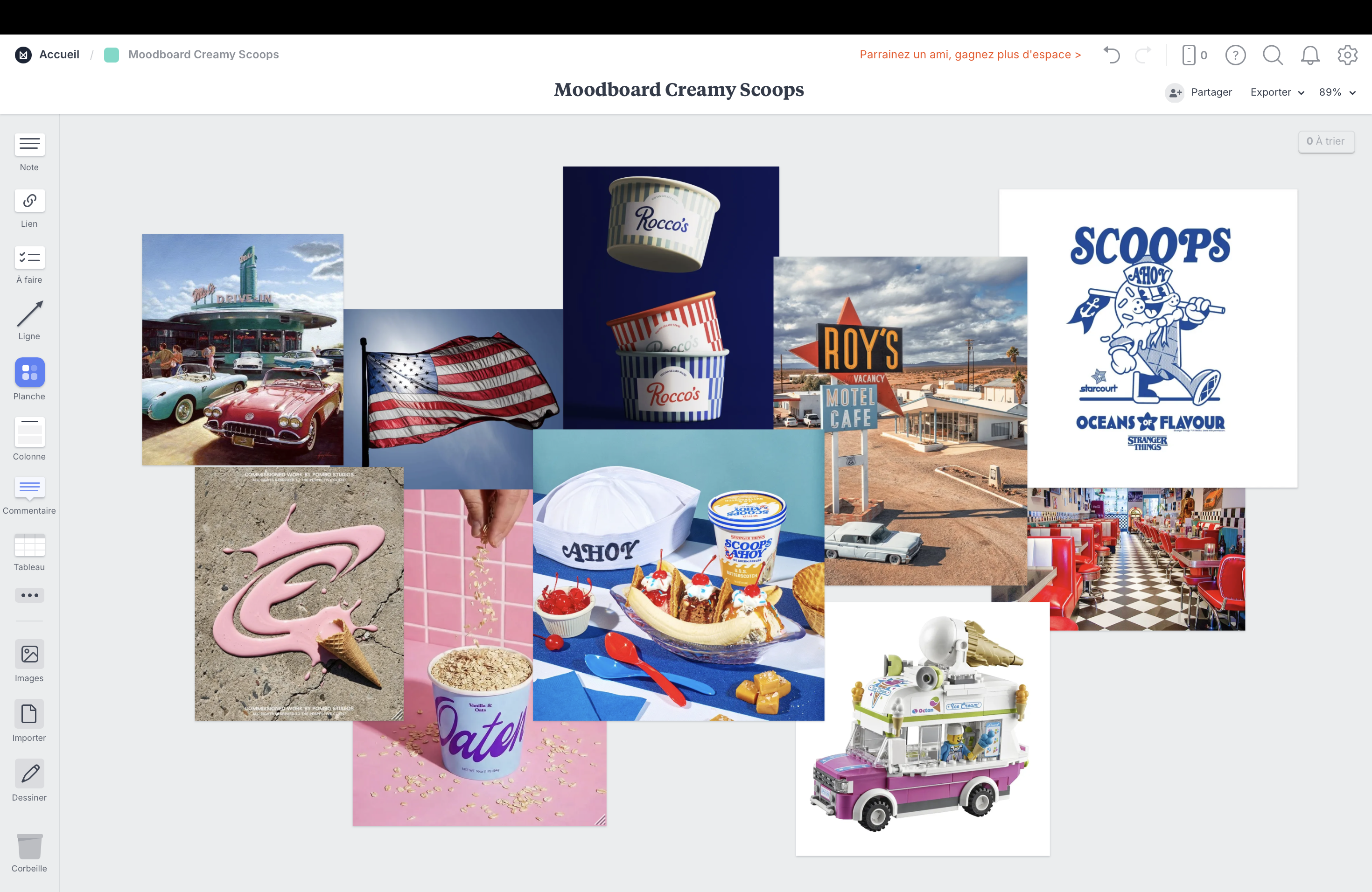
This moodboard clearly draws inspiration from the vintage American diner style, particularly popular in the middle of the 20th century, as well as from more modern advertising imagery featuring vibrant colours and energetic compositions.

Among these references is also a brand that particularly inspired me and whose visual world I absolutely love: Scoops Ahoy. For those who may not know it, it is the famous ice cream parlour featured in the popular Netflix series Stranger Things. The aesthetic of the series, which is also strongly inspired by the 70s and 80s, fits perfectly into this world that I am very fond of.

More broadly, this moodboard reflects my admiration for a period spanning from the 50s to the 90s, and for this American culture that has such a distinctive visual charm. What fascinates me most is its ability to evoke a genuine sense of nostalgia in me for an era that I never actually lived through.

Through Creamy Scoops, I would like to share that feeling with the generations that follow. To introduce them to, or let them rediscover, this world through a young, colourful and contemporary identity, allowing these visual codes to continue to live and evolve over time.

The goal is not to bring an era back to life, but to give it a new life, so that its charm can continue to exist, even when it is no longer ours.

#3

Typography

Hand-Painted Character & Structural Contrast

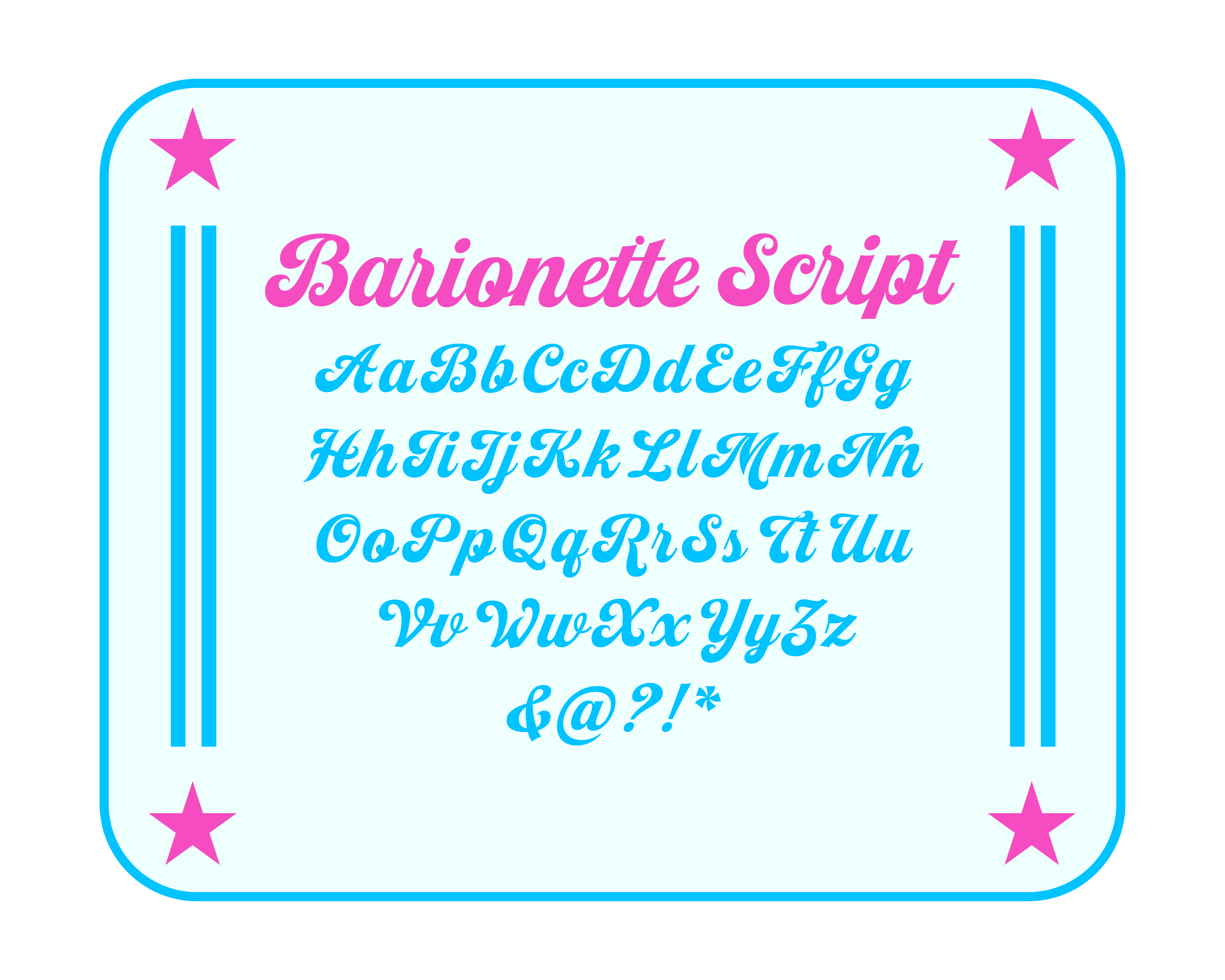
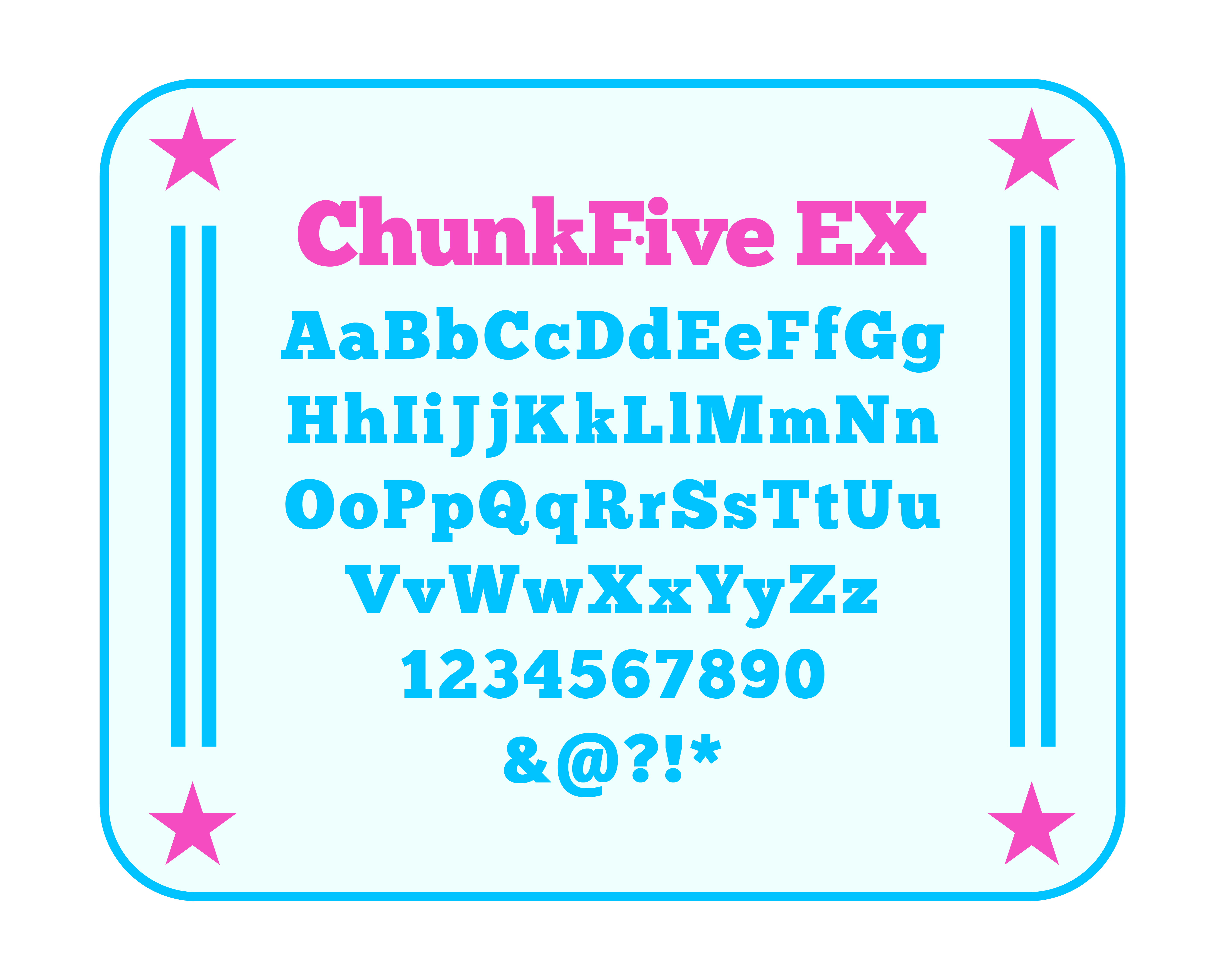
Hand-painted signage script brings warmth, nostalgia and personality, while vintage geometric block type provides structure and bold contrast.

PRIMARY FONT Barionette Script Font Showcase
SECONDARY FONT Chunkfive EX Font Showcase
#4

Color Palette

A High-Contrast Trio of Nostalgic Tones

Creamy Pink brings energy and playfulness, Soft Ice adds creaminess and balance, while Electric Blue delivers diner freshness and high-contrast impact.

#F64CC2
#EEFFFE
#00C3FF